

What is Web Design?
Web design is the process of planning, conceptualizing, and arranging content online. Today, designing a website goes beyond aesthetics to include the website’s overall functionality. Web design also includes web apps, mobile apps, and user interface design.
Did you know that web design can have a huge impact on your performance in search engines like Google? This article will give you some helpful insight into how to create a website that not only looks good but functions properly and ranks highly in search.
In this article we will cover:
- Choosing a Web Design Tool
- Finding Inspiration
- Visual Elements
- Functional Elements
- Types of Web Design: Adaptive vs. Responsive
- Finding Inspiration
Choosing a Web Design Tool
There are two main ways to design a website: using a desktop app or using a website builder. The tool you decide to use will vary greatly based on your team size, your budget, and the type of site you wish to build and its technical requirements.
1. Desktop Apps
Desktop apps require designers to create their design and send it to a development team who can then convert the design to code. The most popular desktop apps for designing websites are Photoshop and Sketch.
Typically, this is the standard for large and/or complex websites because it allows the designer to focus on the overall look and feel, while all the technical challenges are transferred to the development team. Unfortunately, this process can be expensive and time-consuming because multiple resources, skill sets, and team members are required.
To avoid involving a developer, it is beneficial to use a website builder to design a website with fewer technical requirements.
2. Website Builders
There are many website builders on the market today that offer a wide range of features and services. Wix, Squarespace, Webflow, and Shopify, are just a few examples of popular website builders that vary in design capabilities, template options, price, and overall editing experience. Be sure to do your research, experiment with free trials, and determine which platform best fits your website needs.
Website builders create either adaptive or responsive websites, which offer different building experiences. These concepts will be discussed in more detail below so you can best understand which builders will work for you. If you don’t know how to code, becoming familiar with the freedoms and limitations of various website design tools is essential. For example, although WordPress is the most used website platform, it’s not popular with visual designers because of its limited customization options.
Before you start building a website, determine your website needs: Are you creating a photo gallery? How often will you update your site? Do you need a contact form? Choose a website builder that can help you effectively accomplish those goals.
Finding Web Design Inspirations
Web Designers look for inspiration everywhere. Here are some of the best sites to help get your creative juices flowing:
- Behance
- Awwwards
- Web design inspiration
- Site Inspire
Check out our blog post for more tips on finding inspiration here
Web Design Elements
When designing a website it’s important to consider both the site’s appearance and functionality. Integrating these elements will maximize the site’s overall usability and performance. Your site’s usability includes elements such as an easy-to-navigate interface, appropriate use of graphics and images, well-written and well-placed text, and a color scheme. Your site’s performance refers to its speed, ranking, searchability, and ability to capture your audience.
Visual elements
Here’s a quick overview of the elements you should consider while designing your website to make sure everything works well together. Each section will provide tips and tricks to help you get started.
Written copy for Website Design
Fundamentally, your website’s appearance and text go hand-in-hand. It’s important to have your content writers and designers work together in order to create a cohesive design with balanced elements. Focus on creating chunks of text (using text blocks) in order to complement your graphics and images.
Related: Written Content or Design, Which Comes First?
Best Fonts for Website
Choose a font that compliments your overall design. Font should pair with your color scheme, graphics, images, and strengthen the overall tone of your website. Tools like Canva’s Font Combinator can help you find a perfect match for your font. Web design tools like Shopify even include numerous font pairings within their app.

Best Colors for Web Design
Colors are one of the most important elements to consider when designing a website. Keep in mind there are many misconceptions about the psychology of color, and it’s more important to focus on colors that compliment your overall design and tone of your website. Align your color scheme with your brand and the messages you want to convey to your audience.

Website Layout
How you decide to arrange your content will have a dramatic impact on both the usability and functionality of your site. There are no specific rules to follow when choosing a layout, however, there are a few main principles to keep in mind. Make sure to consider the needs of your target audience and avoid using an overstimulating layout that might detract from the messages you want to convey.
Shapes in Web Design
The use of graphic elements in web design can help seamlessly integrate text and images, and help with the site’s overall appearance. Combining beautiful colors and shapes can help direct the attention of your site’s visitors and contribute to your site’s overall flow.

Spacing
Spacing is a key element to creating visually pleasing and easy to navigate websites. Every element in your design will incorporate spacing in one way or another. Appropriate use of whitespace is crucial in creating a design that perfectly balances text, photos, and graphics. Keeping your spacing consistent can help your users navigate your website with ease. The concept of whitespace is definitely a priority of modern web designers.
Images & Icons
Amazing designs can communicate a lot of information in just a few seconds. This is made possible with the use of powerful images and icons. Choose images and icons that support and strengthen your message. A quick Google search for stock images and icons will generate thousands of options. To help simplify your search, here are a few favorites:
Free images for Website and icons
Pexels
Unsplash
IconMonstr
Pixabay
Premium images for Website and icons
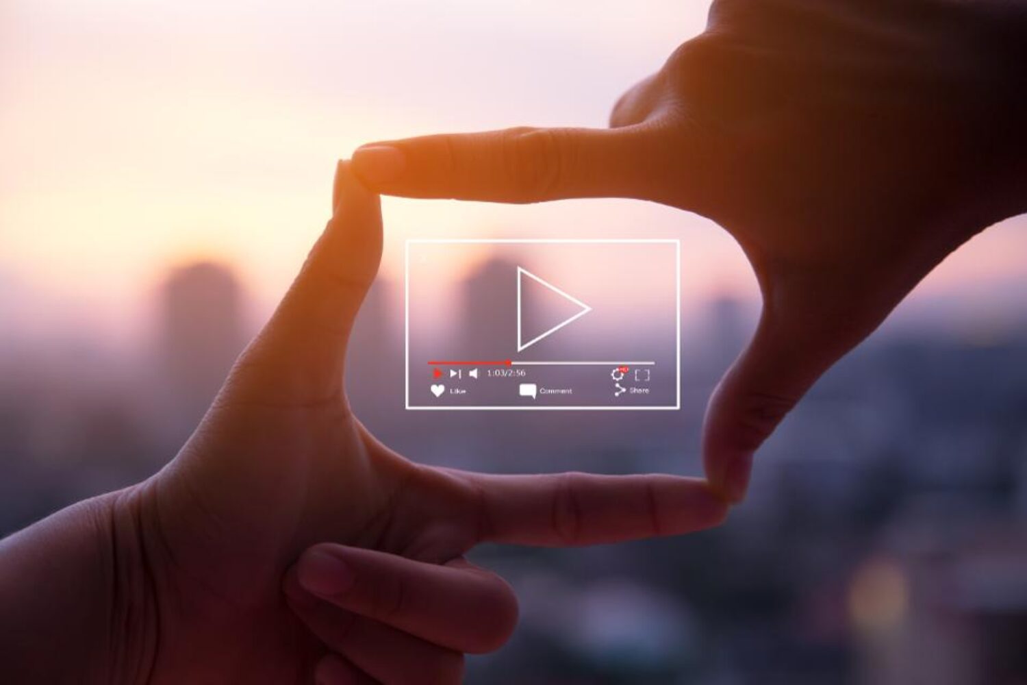
Videos for Website
Integrating videos into web design is becoming increasingly popular amongst designers. When used properly, videos can help your users experience or understand a message that can’t be properly conveyed through text or image. Keep in mind that like having a TV screen on in a restaurant, visitors’ eyes will be drawn to moving images. Make sure your videos don’t compete with or detract from other important elements.
Related: How to use Video Background on Your Website – The Right Way!
Beginner Web Design Functional Elements
These functional elements are imperative to consider when designing your website. A website that functions properly is crucial for ranking highly on search engines and giving your users the best possible experience.
Best Website Navigation
Your website’s navigation is one of the main elements that determine whether your website is functioning properly. Depending on your audience, your navigation can serve multiple purposes: helping first-time visitors discover what your site has to offer, giving easy access to your pages for returning visitors, and improving every visitor’s overall experience. Check out these best practices for more tips on navigation.
Best Website User Interactions
Your site visitors have multiple ways of interacting with your site depending on their device (scrolling, clicking, typing, etc.). The best website designs simplify these interactions to give the user the sense that they are in control. Here are a few examples:
Never auto-play audio or videos
Never underline text unless it’s clickable
Make sure all forms are mobile-friendly
Avoid pop-ups
Avoid scroll-jacking
How to use Website Animations
There are tons of web animation techniques that can help your design grab visitor’s attention and allow your visitors to interact with your site by giving feedback. For example, adding “like” buttons or forms can keep your site’s visitors engaged. If you’re new to web design, we’d recommend keeping your animations simple to avoid developer intervention.
How Website Speed Affects Rankings on Google
No one likes a slow website. Having to wait more than a few seconds for a page to load can quickly deter a visitor from remaining on or returning to your site. Regardless of how beautiful, if your site doesn’t load quickly, it will not perform well in search (i.e. won’t rank high on Google).
Top site builders typically compress your content for faster load times, however, there are no guarantees. Make sure to research which site builders will work best for the content you will have on your site. For example, PageCloud optimizes your images to ensure fast loading times for sites with large and/or multiple photos.
Related: Google’s Page Speed Test

Website Cross-browser & cross-device compatibility
A great design should look polished on all devices and browsers such as Firefox, Google Chrome (yes, even Internet Explorer). If you’re building your site from scratch, we’d recommend using a cross-browser testing tool to make this tedious process faster and more efficient. On the other hand, if you’re using a website building platform, cross-browser testing is typically taken care of by the company’s development team allowing you to focus on design.
Site structure
A website’s structure plays an important role in both user experience (UX) and search engine optimization (SEO). Your users should be able to easily navigate through your website without encountering any structural issues. If users are getting lost while attempting to navigate through your site, chances are “crawlers” are too. A crawler (or bot) is an automated program that searches through your website and can determine its functionality. Poor navigation can lead to a poor user experience and site ranking.
Related: How to Create a Site Structure That Will Enhance SEO
Types of Website Design: Adaptive vs. Responsive
Understanding the pros and cons of adaptive and responsive websites will help you determine which website builder will work best for your website design needs.
You might come across articles online that talk about a whole bunch of different website design styles (fixed, static, fluid, etc.). However, in today’s mobile-centric world, there are only two website styles to use to properly design a website: adaptive and responsive.
Adaptive websites
Adaptive web design uses two or more versions of a website that are customized for specific screen sizes. Adaptive websites can be split into two main categories based upon how the site detects what size needs to be displayed:
1. Adapts based on device type
When your browser connects to a website, the HTTP request will include a field called “user-agent” that will inform the server about the type of device attempting to view the page. The adaptive website will know what version of the site to display based on what device is trying to reach it (i.e. desktop, mobile, tablet). Issues will arise if you shrink the browser window on a desktop because the page will continue to display the “desktop version” rather than shrinking to the new size.
2. Adapts based on browser width
Instead of using the “user-agent”, the website uses media queries (a CSS feature that enables a webpage to adapt to different screen sizes) and breakpoints (certain width sizes) to switch between versions. So instead of having a desktop, tablet, and mobile version, you will have 1080px, 768px, and 480px width versions. This offers more flexibility when designing, and a better viewing experience as your website will adapt based on screen width.
(image credit: UX Alpaca)
Fixed
It does not appear that many new websites really use this layout anymore. Describing it provides a nice starting point to explain the differences with the other types of layouts.
Fixed (aka static) layout has a fixed width in pixels. The ‘container’ of the website is programmed to not move (that’s where the name ‘static’ comes from). This width stays the same independently of which screen size or resolution the viewer has. It appears that the width of 960px is the most widely used size for fixed-layout websites
The drawback is that when viewing such a layout on smaller screens you get the hideous horizontal scroll, which ruins the overview, experience and usability.
The pros of having full control over how the interface looks… do not really outweigh the cons.
Fluid
With fluid layout you specify sizes not in pixels, but in percentages. Meaning, if the screen size changes, the proportion of elements will stay the same.
Adaptive
Adaptive layout means that there are several versions of the layout which are displayed based on the screen size of the viewer. Think of it as several fixed layout designs, layout A is displayed when the screen size is within size range N — NN.
Pros
- WYSIWYG editing (what you see is what you get)
- Custom designs are faster and easier to build without code
- Cross-browser and cross-device compatibility
- Fast-loading pages
Cons
- Websites that use “device-type” can look broken when viewed in a smaller browser window on a desktop
- Limitations on certain effects that only responsive sites can accomplish
Responsive Websites
Responsive websites can use flexible grid layouts that are based on the percentage each element takes up in its container: if one element (e.g. a header) is 25% of its container, that element will stay at 25% no matter the change in screen size. Responsive websites can also use breakpoints to create a custom look at every screen size, but unlike adaptive sites that adapt only when they hit a breakpoint, responsive websites are constantly changing according to the screen size.
Pros
- Great experience at every screen size, regardless of the device type
- Responsive website builders are typically rigid which makes the design hard to “break”
- Tons of available templates to start from
Cons
- Requires extensive design and testing to ensure quality (when starting from scratch)
- Without accessing the code, custom designs can be challenging
Adaptive Website Builders
Wix and Squarespace are arguably the two best visual website builders on the market today. Both use an adaptive approach, meaning their drag-and-drop and WYSIWYG capabilities are second to none. You can build just about anything without having to write a single line of code.
Wix has been around since 2006 and has since developed a wide range of features and templates to suit just about every business need. Today, it’s considered one of the easiest tools for beginners.
Wix has been around since 2006 and has since developed a wide range of features and templates to suit just about every business need. Today, it’s considered one of the easiest tools for beginners.
Although it’s hard to choose a winner in this category, here are few things to keep in mind:
- If you’re looking for the most customizable experience, choose Squarespace.
- If you’re looking for something really easy and don’t have much design experience, choose Wix.
- If you’re looking to work with a developer, choose Squarespace.
- If you want many template options, choose Wix.
- If you like shortcuts and the experience found in desktop publishing apps, choose Squarespace.
As both platforms offer free trials, we’d recommend trying them both before deciding.
Responsive Website Builders
Tools like Squarespace offer responsive website builders, however, this means your editing experience is more limited. Creating a fluid responsive website is hard, and without knowing how to code, it is nearly impossible to build unique websites using responsive website builders.
This is where more complex web design tools, like Webflow and WIX, come into play. Here are some of the pros and cons to consider when looking to adopt one of these tools:
Pros
- Ability to create custom responsive sites without having to write code
- Unmatched control over every element on the page
- Ability to export code to host elsewhere
Cons
- Complex tools with steep learning curves
- Slower design process than adaptive website builders
Next Steps
Hopefully, this article helped you to better understand the essentials in web design. To review, let’s take a look at some key elements in designing a website that is both beautiful and functional:
1. The user always comes first: user experience should be at the forefront of your design, as your users will ultimately be the ones to determine whether your website is worth visiting.
2. Choose the best website builder for your needs: ask yourself what your website’s major functions will be, and choose a website builder that will ensure those needs are met.
3. Balancing visual elements: it’s important to maintain a balance between your text, graphics, multimedia, and color scheme to avoid an overstimulating website that detracts from the messages you are trying to convey.
Now that you’ve mastered the basics in website design, be sure to check out more posts to learn more about types of website builders, design trends, design elements, and much more.
To Speak with one of Web Design Experts Call (615) 909-5700 or Contact Us Online Here
Nashville Web Design
Voted Best in the United States 2021
The best web design companies Nashville TN has to offer is provided by Up2Paar. Best company for lead generation and NEW business website design Nashville TN. We work with start-ups to Fortune 500 companies. No project is too big or small, we treat all our clients equally.
A Nashville TN Web Design Agency – Mobile Web Design, Strategic Marketing
22+ years of being the Best Web Design Company in Nashville TN. Up2Paar has offered hundreds of clients in the United States and in Nashville’s Web Design services and digital offerings. We have been developing websites since the inception of online marketing and eCommerce, we designed some of the first internet boards before websites existed. Our web design team focuses on appealing designs, with a strategy on user experience, search engine optimization, and functionality. Let us create a competitive online advantage for you.

NASHVILLE TN WEB DESIGN
Award-Winning Nashville Web Design & Marketing Services
eCommerce Web Design
Do you have 1 product or 30,000, Up2Paar team has developed some of the most complex eCommerce Web Designs in the world. We worked with Toomey’s Mardi Gra who has over 70,000 products.
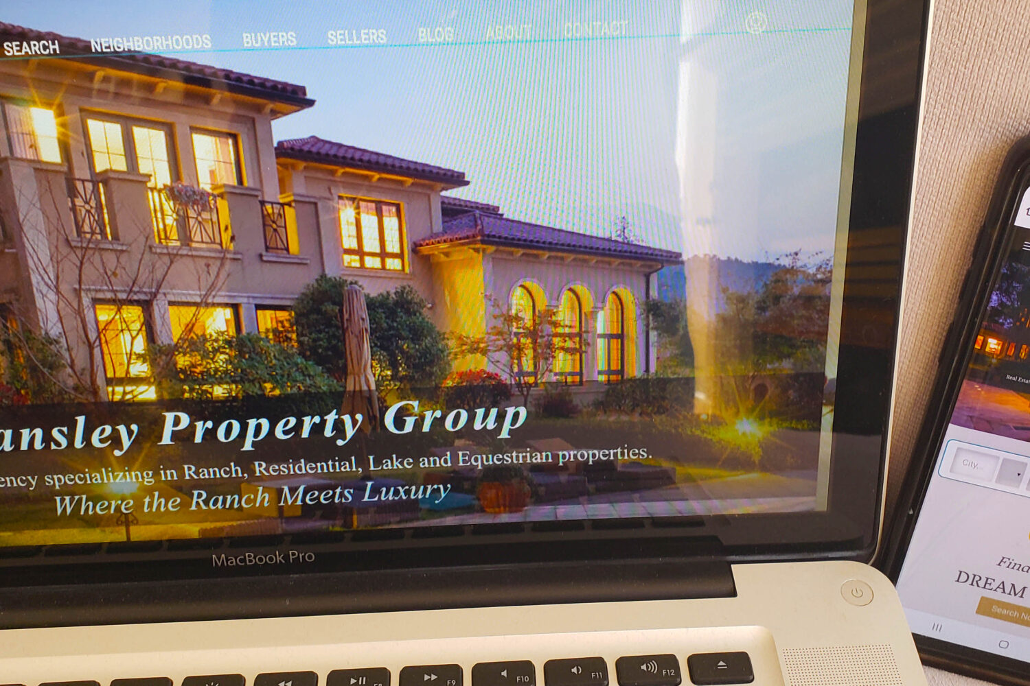
Video Website Design
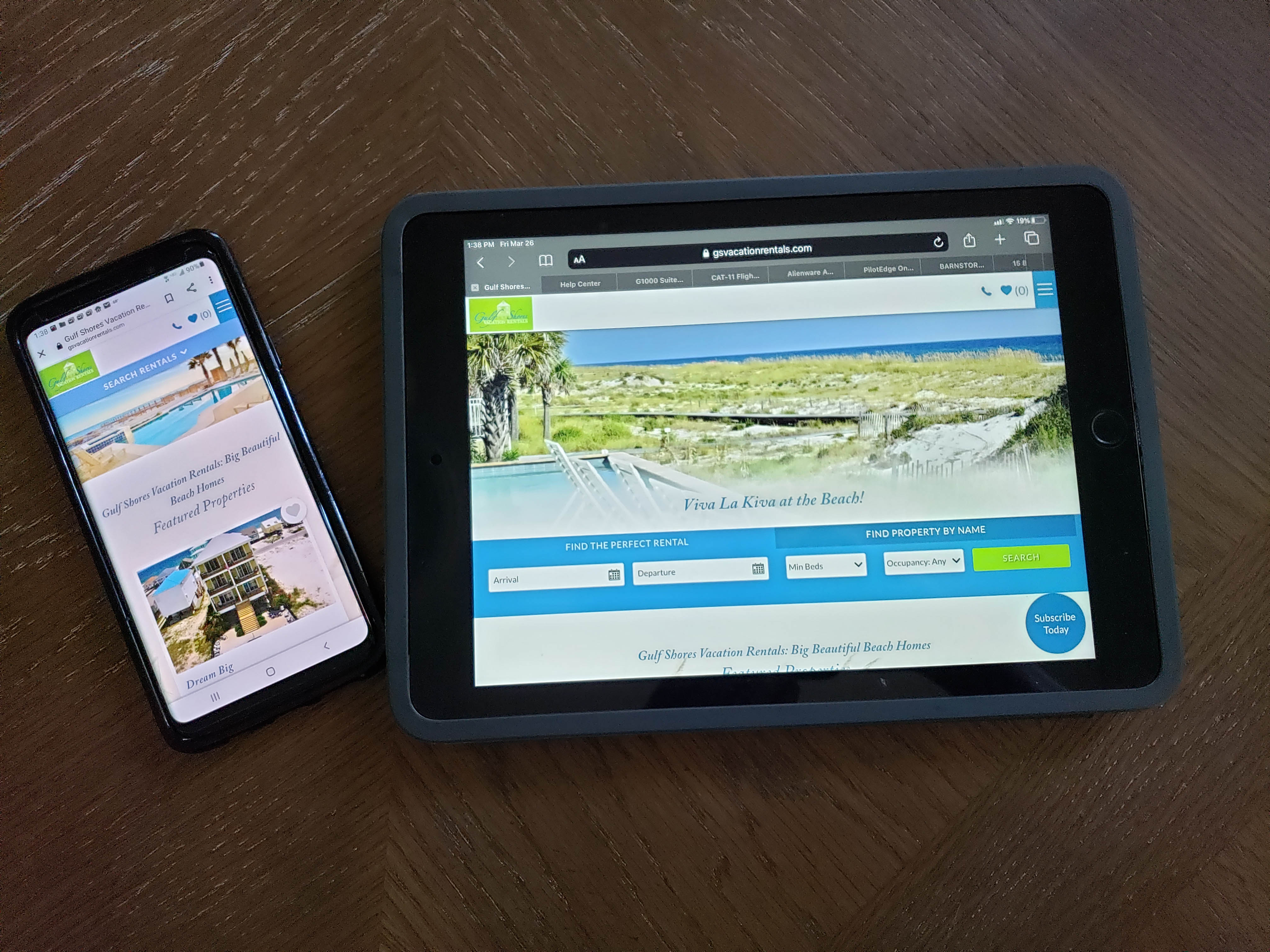
Gulf Shores Vacation Rentals, charged Up2Paar in Nashville to create a custom web design with a web video streaming platform – for a user experience to allow consumers to book beach properties. Up2Paar also has developed many successful videos and YouTube channels.
Inbound Marketing & Automation
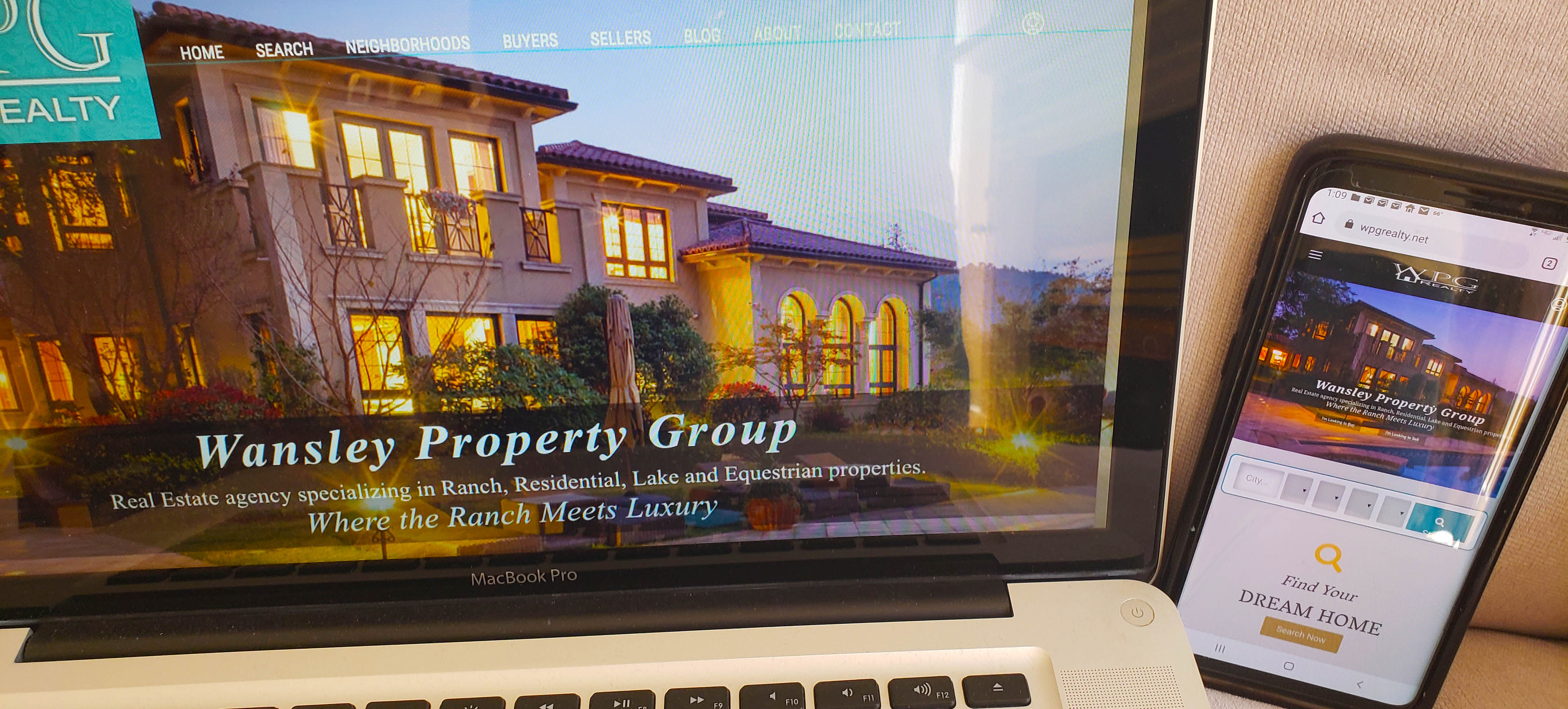
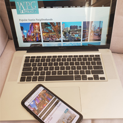
After the completion of their new website design, WPG Realty engaged Up2Paar for comprehensive Inbound Marketing efforts, including social media and video work.
Nashville Website Design Process: This is How We Do It
1.
Review & Onboarding
2.
3.
Driving More Leads & Creating More Exposure
A few of our fabulous clients past and present.


Up2Paar has been voted the top Web Design company and recently Top SEO Company in the United States by upcity.com. Our customers say great things about us. Nashville’s Up2Paar has a mission to provide meaningful online solutions to businesses while removing the risk and costs of a customer building its own website, infrastructure, and online marketing team.
Your website design is every consumer’s first impression of your business and brand online. Customers considering doing business with you, looking to do more, or looking for your services will inspect your web design and draw conclusions immediately based on the website design.
One of the major differentiators of Up2Paar is that we lead with the end goal and mind. This means there is focus on what that web design means to your business online whether you are focused on Nashville or national business let’s make sure the web design attracts the right traffic for your organization. Anyone can build a website but anyone cannot build a high converting website with real marketing results. A great web design drives:
- Your brand identity and marketing
- True lead generation with automatic appointment setting
- The user experience
- Customer conversion (sales, revenue, leads, etc.)
- The functionality and flow of the website (ease of use)
- Your businesses marketing message to the world
“Up2Paar Was Very Patient And Really Worked Hard To Build A Website We Were Happy With. Up2Paar Has Done A Superb Job Outlining And Implementing An Optimization Strategy That Perfectly Complements Our Site And Service Has Been Of The Highest Quality. Since Our Site Was Optimized, We Have Experienced A Tremendous Increase In Quality Leads From The Website”
– Trinity Contractors Aimee Jones
Our Work.
We believe our work speaks for itself. Browse our most recent projects below
and enjoy our handmade work with love for every detail.
Get more visitors, more leads and wider coverage,
Higher ranking in search engines.
CONTACT US
Same Day Response!
Call us
(615) 909-5700
Mail us
info@up2paarllc.com
Visit us
Nashville, TN 37215
(615) 909-5700
CALL US TODAY!
Some Of Our Marketing Services
Funnels
Lead Generation & 24/7 Call, Sales Funnel Development, Center Lead Capture + Handling, Funnel Hacking the Competition
Rivals & Competition
Competitive Threat Analysis
& Market Report
Branding
Brand Strategy, Identity
Development, & Design
Platforms
Solution Recommendations, Strategy
Buying, & Implementation
Web Development
Website Planning,
Design, & Development
Digital Advertising
Paid Search, Social, &
Retargeting Ad Campaigns
Search Engine Optimization
Improve your website’s search engine ranking, smart site mapping, and an intelligent approach to keyword optimization.
Live Chat Services
Never miss a highly-qualified lead again—use US-based chat specialists to answer any questions or comments visitors to your website
Online Reputation Monitoring
Know when your customers leave reviews on websites like Yelp and Google My Business. The more quickly and professionally you can reply to consumers, the stronger your reputation.
Web Based Software
SaaS Products PMG provides an extensive list of software development services to help you navigate through the adoption of Software as a Service (SaaS).
Video Production & Editing
We are a full service, professional video production company. We deliver content rich video and motion graphics with the capability to produce your project.
Training & Safety Video ProductionBid Writing & Consulting
We can help you remained focused on your business while preparing responses to proposals that maintain the same standard of excellence you provide.
Don’t Get Beat By The Competition, Call Us Today!
Award Winning Web Design With Functionality
Design and Mobile Friendly is Key, Most of all Results
Why choose us for your Web Design in Nashville TN?
You could choose any web design company, but you deserve the best right here in the USA. Call us now to get started (615) 909-5700. Ask about our FREE web design packages.
Up2Paar, Inc. is one of the most successful award-winning Web Design Nashville TN web design companies in the country. More than 24 years of experience with proven friendly service makes us an outstanding web design solution for your business.
Up2Paar has long established its reputation as a leading website design Nashville TN web design company through its award-winning web design solutions. We focus on search engine-friendly websites that help our clients gain a stellar, organic search engine ranking.
Our Web designers use the latest and greatest in user-centered design theory and usability standards. PMG utilizes web design to:
- Make you and your brand look snappy
- Help your clients find you with ease
- Drive your conversions and sales
Contact us to see how we can make your marketing dollar go further through our website design services.
Call us at 615-909-5700 for a free quote.
We specialize in:
- Premium Web Design
- eCommerce WebSites
- Internet Marketing
- Mobile Web Design
- Social Media Marketing (SMM)
- Search Engine Optimization (SEO)
- Premium Logo Design
- Corporate Branding
Our professional in-house website designers are experts at delivering marketing solutions for any industry. As a leading provider of web development services, we produce top-ranked websites time and again.
ASK ABOUT OUR FREE WEBSITES!
Brentwood TN Digital Marketing, Brentwood Tn Seo, Brentwood TN Web Design, Brentwood TN Web Design Team, Brentwood TN Website Development, Brentwood Web Design, Brentwood Website Design, Franklin TN Web Design, Huntsville AL Web Design, Marketing Agency Brentwood Tn, Nashville TN Web Design, SEO In Brentwood TN, Top SEO Company In The United States, Web Design, Web Development


 Safety orientation videos are also great for showing off your facility to current and future clients, visiting management, or other guests, without having to lead them through the entire site. They can experience all your site has to offer without ever leaving the board room. It can also save you money with your
 The reality of the visual internet in 2021 is that it’s – in a word – crowded.

